UX Research
Existing Product Research
In this 11-week project cycle, I started with comprehensive competitor research to understand the landscape of digital financial policy management tools. This analysis informed our design strategy for a benchmarking guide aimed at policymakers in underbanked countries. I reviewed both direct and indirect competitors to identify best practices, innovative features, and common pitfalls, evaluating their approaches to data presentation, user interface design, accessibility, and overall user experience. This helped pinpoint areas where the UNCDF Policy Accelerator could stand out and provide unique value.
I also examined the technological frameworks and data management strategies used by competitors. This enabled us to propose solutions that effectively addressed user needs while leveraging the latest web technologies and data visualization techniques. The findings from this analysis shaped the project's strategic direction, ensuring that the final product would prioritize ease of use, data integrity, and actionable insights.
User Interviews and Written Surveys
Following the initial research phase, we shifted focus to gather feedback from existing users through interviews and surveys. We conducted detailed interviews with six key stakeholders and distributed a survey to collect quantifiable data from a broader user base. This dual-method approach provided a comprehensive understanding of user experiences, preferences, and pain points. Analyzing this data, I synthesized actionable insights that directly influenced our design strategy, aligning our solutions with user needs. This process enhanced my user research skills and emphasized the importance of empathy in creating user-friendly digital financial tools.
Affinity Mapping
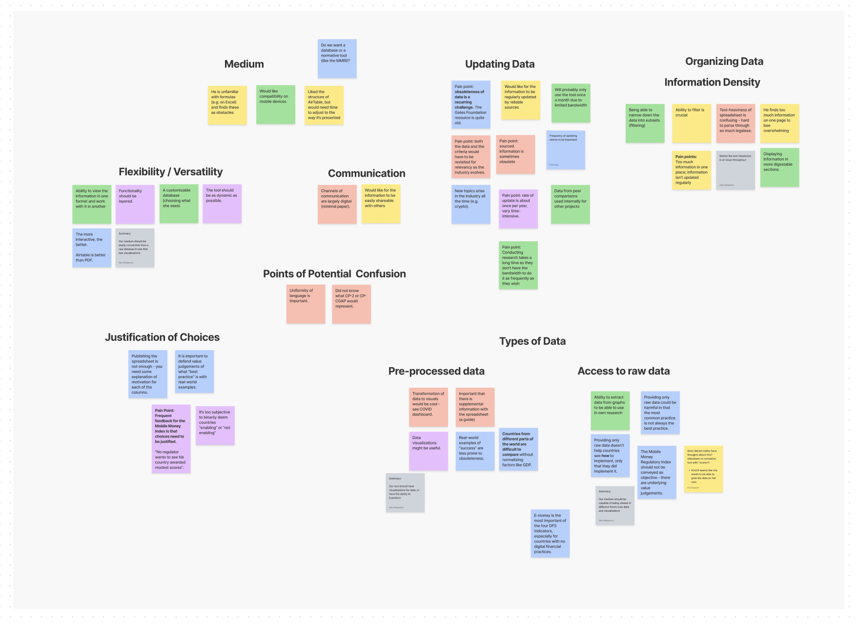
After gathering insights from interviews and surveys, I used affinity mapping to identify critical pain points. By organizing feedback visually, we categorized pain points into four main areas. This helped us prioritize design features to address these issues effectively. For example, feedback on data quality and presentation led to features that enhanced data credibility and user engagement, such as standardized formats and clear sourcing. Insights on anticipating user questions and benchmarking needs resulted in more intuitive navigation solutions and a mix of raw and visual data representations.
Pain Points Uncovered
1. Anticipating User Questions: Users needed clearer justifications for design and data decisions, with confusion stemming from too much information and unfamiliar terminology.
2. Data Quality: Non-standardized data and lack of sources and dates compromised trustworthiness and comparability.
3. Data Presentation: Information overload was an issue, with data presented all at once and language barriers limiting accessibility for non-English speakers.
4. Meeting Benchmarking Capacity Needs: Users needed both raw data for detailed analysis and visual representations for intuitive understanding.
Impact on Design Decisions

Affinity mapping provided a clear visualization of user needs and a roadmap for our design process. It ensured that our solutions were grounded in real user experiences and challenges. This process was crucial in moving from understanding user needs to creating a prototype that effectively addressed those needs, embodying the principle that good design starts with and is continually informed by user feedback. This meticulous approach guided us in creating a more intuitive, accessible, and effective tool for policymakers in underbanked countries.
Design Phases
Low-Fidelity Phase
During the low-fidelity phase, we focused on creating rough sketches to test our initial ideas and gather feedback. Our primary goal was to explore the layout and structure without getting bogged down by visual details. Here are the key designs developed during this phase:
- Main Navigation Page: Split into three parts to prevent information overload, this page includes a navigation bar, title, and banner at the top; an optional "At a glance" section in the middle; and four collapsible tabs (Airtable, Excel spreadsheet, visualizations, and further information) at the bottom.
- Presentation of Resources: Each key resource had its own tab with sections like Introduction, Key Functions, Key Terms, and Walkthroughs to address user concerns directly.
- Presentation of Visualizations: Two versions were created—one with an interactive map generating visualizations based on selected countries and another with pre-made data visualizations.
- Presentation of Additional Resources: A tab for potential next steps was designed to include options for user feedback and connecting with experienced stakeholders.
The low-fidelity prototypes allowed us to quickly iterate and refine our ideas based on internal feedback.

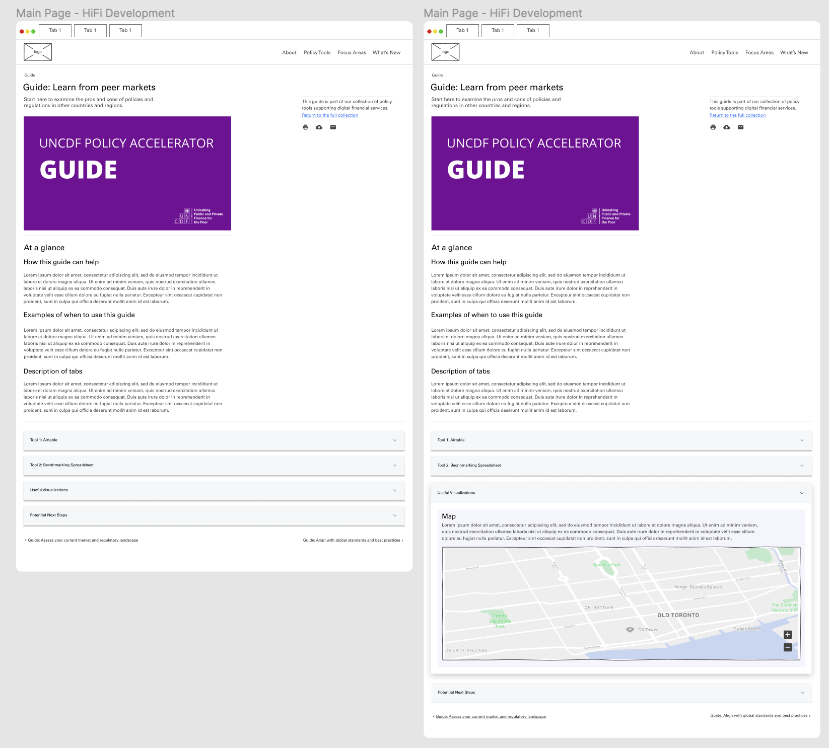
High-Fidelity Phase
In the high-fidelity phase, we created detailed, interactive prototypes that closely resemble the final product. These prototypes included more precise layouts, colors, and styles. Here are the highlights of our high-fidelity designs:
- Guide Landing Page: Redesigned to improve navigability, the landing page features a top section with a navigation bar and guide banner, a compressed middle section with an "At a glance" description, and a bottom section with four collapsible tabs.
- Visualizations Tab: We developed a high-fidelity prototype of the interactive version, which includes an interactive world map and data visualizations based on selected countries. Another option allows users to filter visualizations based on specific characteristics.
- Ideal Feature Ecosystem:
- Accordion-Style Organization: Drop-down pages for relevant items to improve navigability while maintaining the 4-step framework.
- Specific Walkthroughs of Resources: Separate pages for the Airtable and Excel spreadsheet to guide users on applying the four steps.
- Interactive Potential Next Steps Section: Mechanisms for feedback, help, and mentorship, connecting users with experienced stakeholders for direct guidance.
The high-fidelity prototypes were crucial for demonstrating the final design solutions and easing the implementation process. They provided a clear and interactive version of the features, ensuring that our designs were user-friendly and effective.
These design phases allowed us to move from initial ideas to a polished prototype, ensuring that our solutions were well-informed by user research and feedback.
Conclusion and Takeaways
Through this project, I learned the importance of user-centered design, empathy, and iterative processes. Engaging with users through interviews and surveys provided crucial insights, ensuring our designs met real needs. The iterative approach, from low-fidelity sketches to high-fidelity prototypes, allowed continuous improvement based on feedback.
Key takeaways include:
- User-Centered Design: Direct user engagement ensures solutions are relevant and effective.
- Empathy: Understanding user challenges leads to more intuitive and accessible designs.
- Iterative Process: Flexibility and adaptability in design result in better outcomes.
- Interactive Elements: Enhancing user engagement through technology improves usability.
- Collaboration: Continuous feedback and teamwork lead to robust solutions.
- Simplicity: Clear, organized presentation of information aids user navigation.
These insights will guide future projects, ensuring designs are user-focused and effective.